

In a previous article we broke down why three designs look good. In this article we will analyze four additional user-interface designs and discuss the visual-design principles that make them attractive. Afterall, how something looks affects the perception of how well it functions.
Example 1: Comfortable Editing Experience
Our first example is from Dovetail, a data-analysis platform. This design used a grid, a type system, and consistent iconography to create a comfortable editing and reading experience.
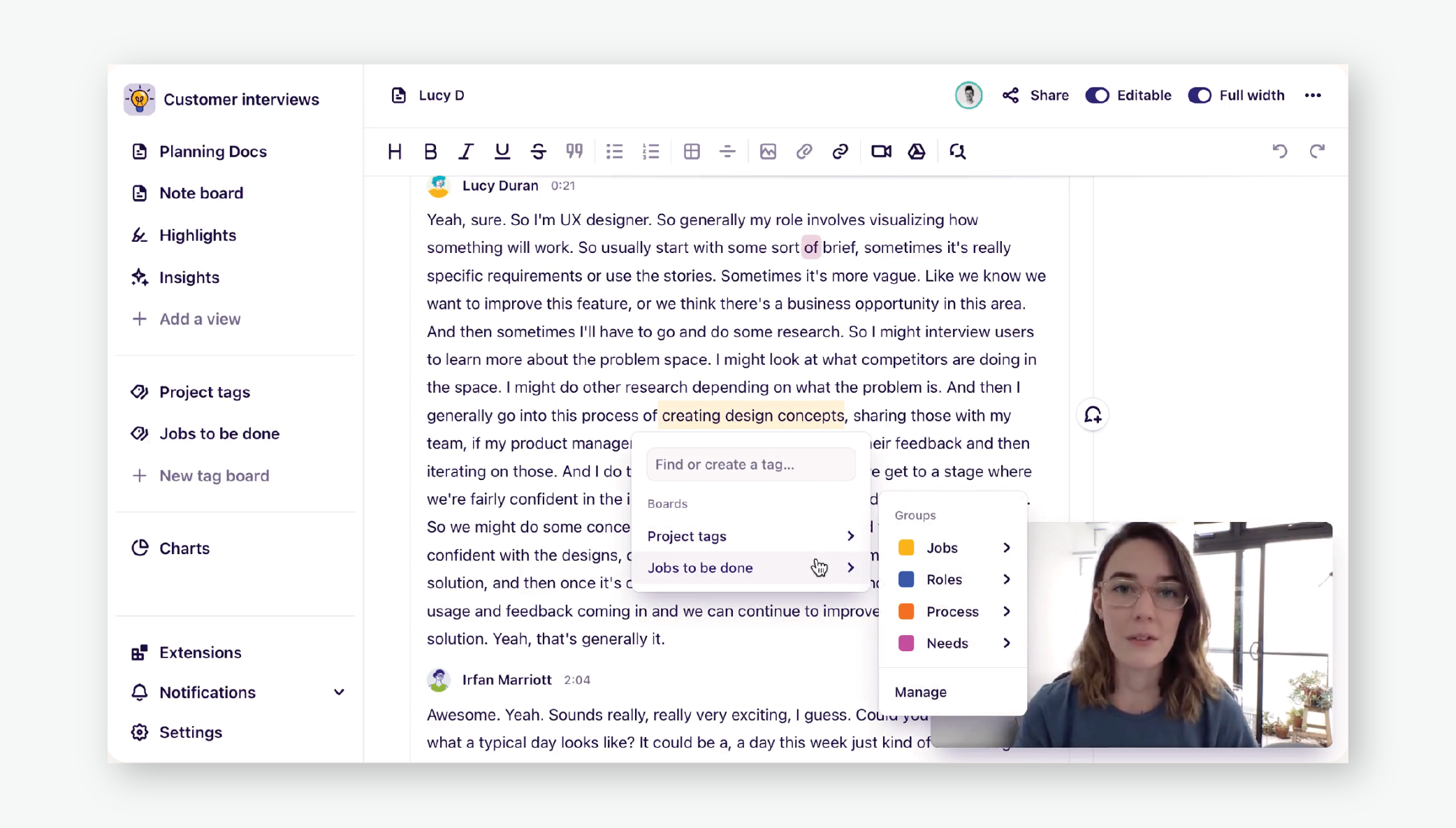
Alignment to a grid. A 3-column grid acted as a base to which elements are aligned. The leftmost grid line provided a vertical anchor for the sidebar navigation. The middle column of text was also left aligned to a grid line, and the rightmost grid line separated the tags and comments area. Setting up a grid in your designs will keep elements aligned consistently across different screens.
Type styles for different types of content. Dovetail used a single font family to provide a consistent typographic experience. Within this font family, there were multiple type text styles and color variations (navy blue and gray). Each variation was used to differentiate between types of content, thus taking advantage of the Gestalt law of similarity. For example, in the sidebar navigation, Add a view and New tag board are both unbolded and gray indicating they were the same type of action (creation Avoid using many different type styles in your design, so you do not overwhelm your users.
Text-line spacing and length. The large text block was airy due to its generous leading (i.e., the distance between the baselines of two consecutive lines of text) and, together with the relatively short line length, allowed for comfortable reading (and editing) experience, since the eye could easily locate the next line down.
Visually consistent icons. The many icons used in Dovetail’s app shared line thickness, slightly rounded corners, and looked similar in size. These small details create a unified icon set and bring polish to your design. However, remember that icons are always more easily recognized and, according to Fitts’s law, faster to tap if they have labels.
Example 2: Modular Grid
Our second example is from MoMA (Museum of Modern Art)’s website. This design utilizes a modular grid structure, a fun color palette, and imagery to create an exciting, appealing visual experience.
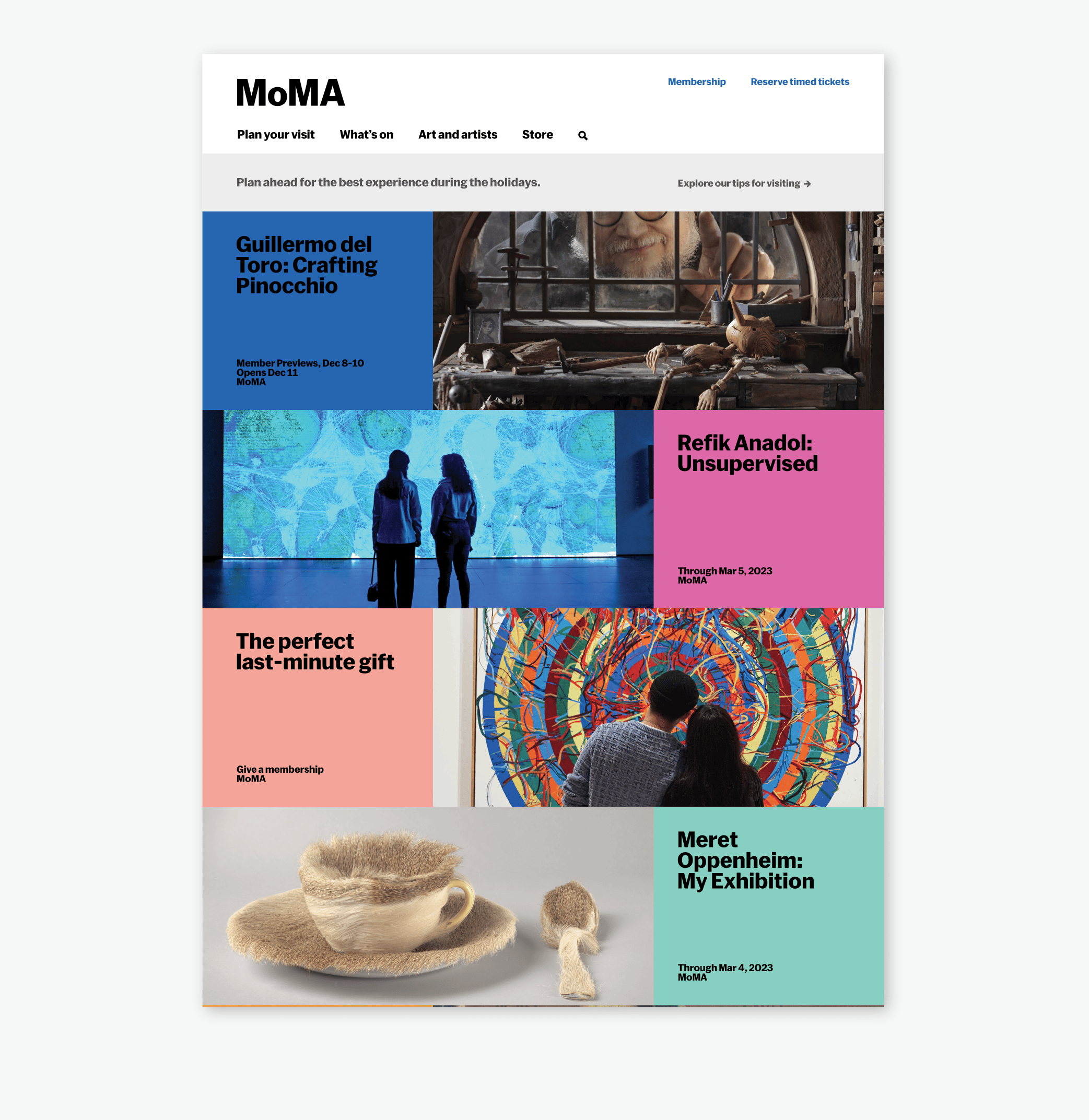
Asymmetrical balance. Balance is the satisfying arrangement or proportion of design elements and occurs when there is an equally distributed amount of visual signal on both sides of an imaginary axis. In this case, this imaginary axis runs vertically through the middle of the screen (in orange). If you look at the design elements on either side of this axis, you will see colorful blocks of text and images that alternate on both sides. This weaving effect creates a sense of balance, as well as a sense of energy and movement, begging us to engage with it. No one element, or in this case exhibition, is more important than the others.
The type of balance that you should use in your designs depends on what you want to convey. Asymmetrical balance, like in this example, is dynamic and engaging, whereas symmetrical balance is quiet and static.
Playful color use. MOMA uses a complex, yet playful color system in its design. Its color system is constantly evolving as new exhibitions are added to the site and old exhibitions conclude. These playful color blocks encourage the user to click and discover. More importantly, colors are used consistently throughout the site. For example, the hot pink used for the Refik Anadol exhibit on this homepage, is also used on the specific exhibit page.
Content styling. The typographic styling and color use make the content blocks feel special, allowing them to stand on their own if needed. Although the content changes, the type treatment remains consistent and the only variation is in text size (large vs. small).
Meaningful imagery. Images provide a glimpse into what each exhibit offers, rather than being purely decorative. They are cropped appropriately, with the most important element still in view. Your images should add value to your page — for example, by adding supplementary information and detail about a product or concept. Make sure your cropped images make sense, especially at different screen sizes.
Modular grid structure. These content blocks and images are laid out on a modular grid structure with both rows and columns (or modules). At this desktop size, rows are made up of 3 consistently sized modules. The colorful blocks of text take up one complete module and their corresponding images take up 2 modules each. This type of grid structure is very flexible and allows for many combinations, making it suitable for lots of different designs.
Example 3: Monochromatic Color Palette and Symmetrical Imagery
Our third example is from Aesop, a luxury skincare company. This design utilizes a monochromatic color palette and negative space to create a refined, clean interface.
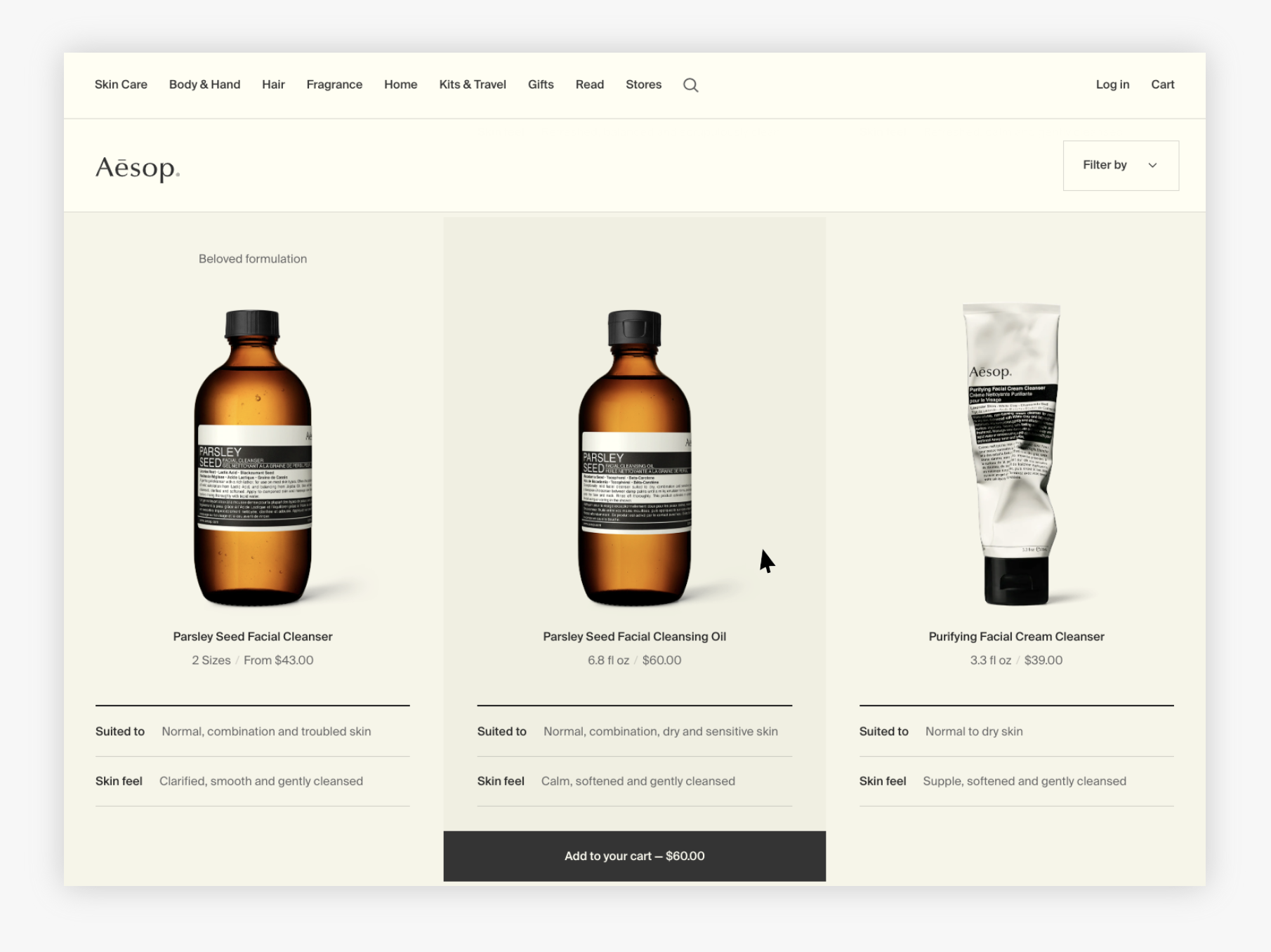
Monochromatic color palette. Color palettes are sets of colors that have been selected for a particular project, brand, or set of designs. Each individual color plays a role and adds to the visual appeal of the interface. Aesop’s monochromatic color palette is harmonious — though the muted yellows used for the background are similar, slight variations differentiate among the navigation and title area, the product area, and the hover state (in the screenshot above, the item in the middle). Gray and black work together to create a visual hierarchy for typography (black for primary text and gray for secondary).
Monochromatic color palettes are the easiest to create and apply and require little visual-design experience. By limiting your palette to 3-4 colors, you will be able to easily convey visual hierarchy and contrast because there will be fewer elements to overwhelm or distract users.
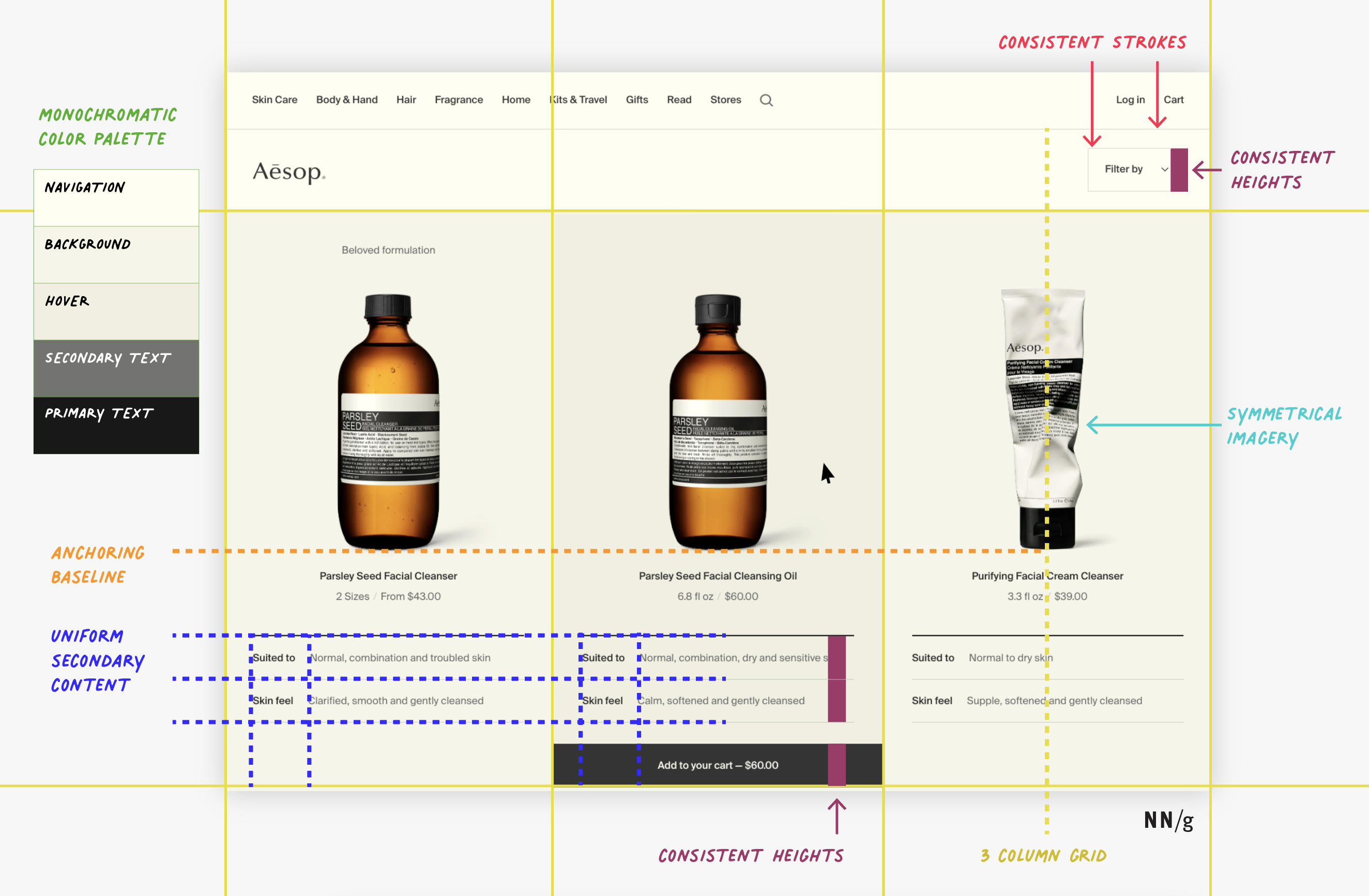
Uniform secondary content. Aesop’s design is especially good looking for three primary reasons. First, it uses two stroke widths (the top one bold to separate the main product from its attributes, the bottom ones lighter to separate the attributes). Second, type variation (bold for the attribute labels and normal for the attribute values) allows the eye to quickly focus on whatever attribute is most important for that particular user. Third, alignment to a grid makes the design looked polished and clean, while also facilitating scanning. Each item’s secondary content has same height and padding and is left-aligned to the same grid line. In the screenshot below, you can see the same visual system for secondary content applied on individual item pages to organize additional information.
Symmetrical imagery. Symmetry makes an interface feel balanced and predictable. Aesop uses symmetrical imagery to balance and anchor each product. The imagery is centered within the column and anchored to the same baseline. This gives the interface visual order — everything else within the column can center on the same axis: product title and size, the secondary-content lines, and the Add to cart button.
Consistent, fixed heights. When designing responsive websites, widths, heights, and paddings may adjust depending on the overall width of your user’s window. However, within each responsive range, consistent, fixed widths help designs look aesthetically pleasing and refined. In the above Aesop example, interface elements such as the Filter by button, the Suited to’ and Skin feel secondary information rows, and the Add to cart button have the same height, regardless of window width.
Example 4: Simple and Plain
Our fourth example is from Superhuman, an email client. This example proves that you do not need color, fancy icons, or imagery to make a design look good. Even a simple interface can look aesthetically pleasing if it leverages basic principles of visual design.
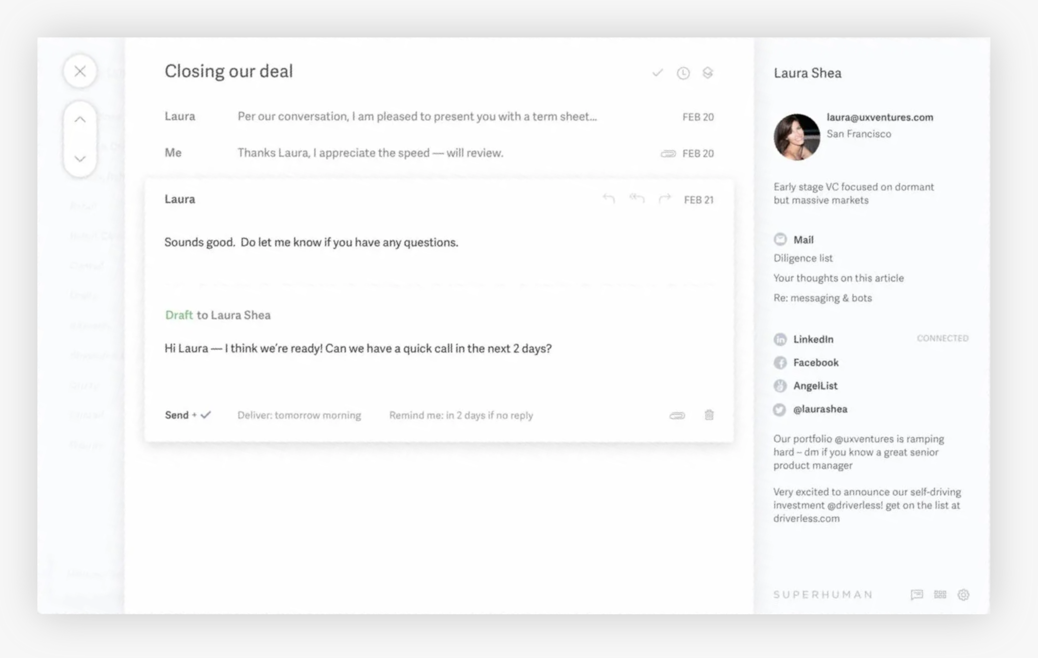
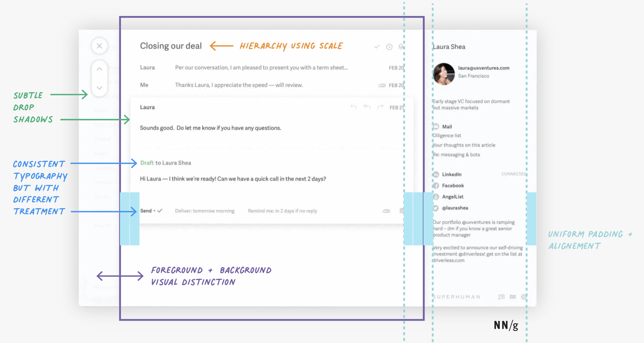
Scale to create hierarchy. In simple, text-oriented interfaces, varying your text size creates visual hierarchy and clarity, while also breaking up what would otherwise be a wall of text. The email subject Closing our deal has the largest type size to appropriately indicate its relative importance on the page. To use scale to create hierarchy in your own designs, first identify what is most important. Make this component 30–50% larger than other components.
Subtle drop shadows. Drop shadows and gradients add depth and create differentiation between UI elements. However, they can also be misused and overused. In the Superhuman example, drop shadows create a focus area (the email thread) and differentiate it from additional information (the navigation and details about the sender). The drop shadows also help the user identify the primary buttons (the close X and paging arrows).
When applying drop shadows and gradients in your own designs:
- Use only two colors and avoid contrasting colors. Ideally, use only two monochromatic or analogous colors (groups of colors next to each other on the color wheel) that coordinate with your color scheme).
- Introduce an opacity on the drop shadow to help the gradient blend with the rest of the interface.
- Consider the light source and keep it consistent if using multiple drop shadows or gradients (for example, the direction of light to dark should be the same across gradients or the shadow should fall in the same direction across drop shadows)
- Match the direction of your drop shadow to the shape to which you are adding the gradient (for example, linear gradients for squares and radial for circles).
Foreground and background distinction. The best way to visually breakup an interface is with a shift of background colors. This shift creates the illusion of a foreground (which will draw the users’ attention first) and background. In Superhuman’s example, the email thread is on a white background, while the sender’s information is on light gray. If they were both the same color, the interface would lack depth and it would be harder to distinguish between different areas of the interface ad their relative importance.
When using background color to create distinction in your interface, choose colors that are the same saturation. For example, white pairs well with light gray, while black pairs well with dark gray. If your background is a color, choose a secondary monochromatic as your foreground color.
Varying type styles within a consistent font family. Superhuman uses different type styles from within the same font family (small caps and bold) and slight changes in color (green, black, and gray) to differentiate between different types of content and focus the user. For example, Draft is the same font and size as the rest of the header to Laura Shea, but the change in color keeps the design from feeling flat and makes it easy to scan, while also appropriately differentiating the state of the email (draft versus sent).
As a rule of thumb, identify a typographic system and consistently use the same type variant or style (color, bold, small caps) for the same purpose. You see this recommendation in practice in Superhuman’s example:
- Dates in small caps (for example, FEB 20)
- Bold for integrations (for example, LinkedIn and Facebook)
Conclusion
It takes careful consideration to create good-looking designs. Following visual-design principles is the first step in producing a beautiful design.


