
While you should never judge an album by its cover, some album artwork is so atrocious that one can only wonder why, how, and who thought that it was representative of the music within.
While there are numerous examples of truly cringeworthy artwork, this list will only consist of albums that I have in my physical collection or digital library. Hence, you likely won’t find many of the common ones found in other lists such as The Beatles’ Yesterday And Today or John Lennon and Yoko Ono’s Two Virgins: Unfinished Music Vol. 1. Nor will you find the oddities that no one cares to even listen to. No need to worry, however, as Black Sabbath’s Born Again is most certainly featured in this list.
Keep this page bookmarked for the list, in alphabetical order, will be updated regularly.
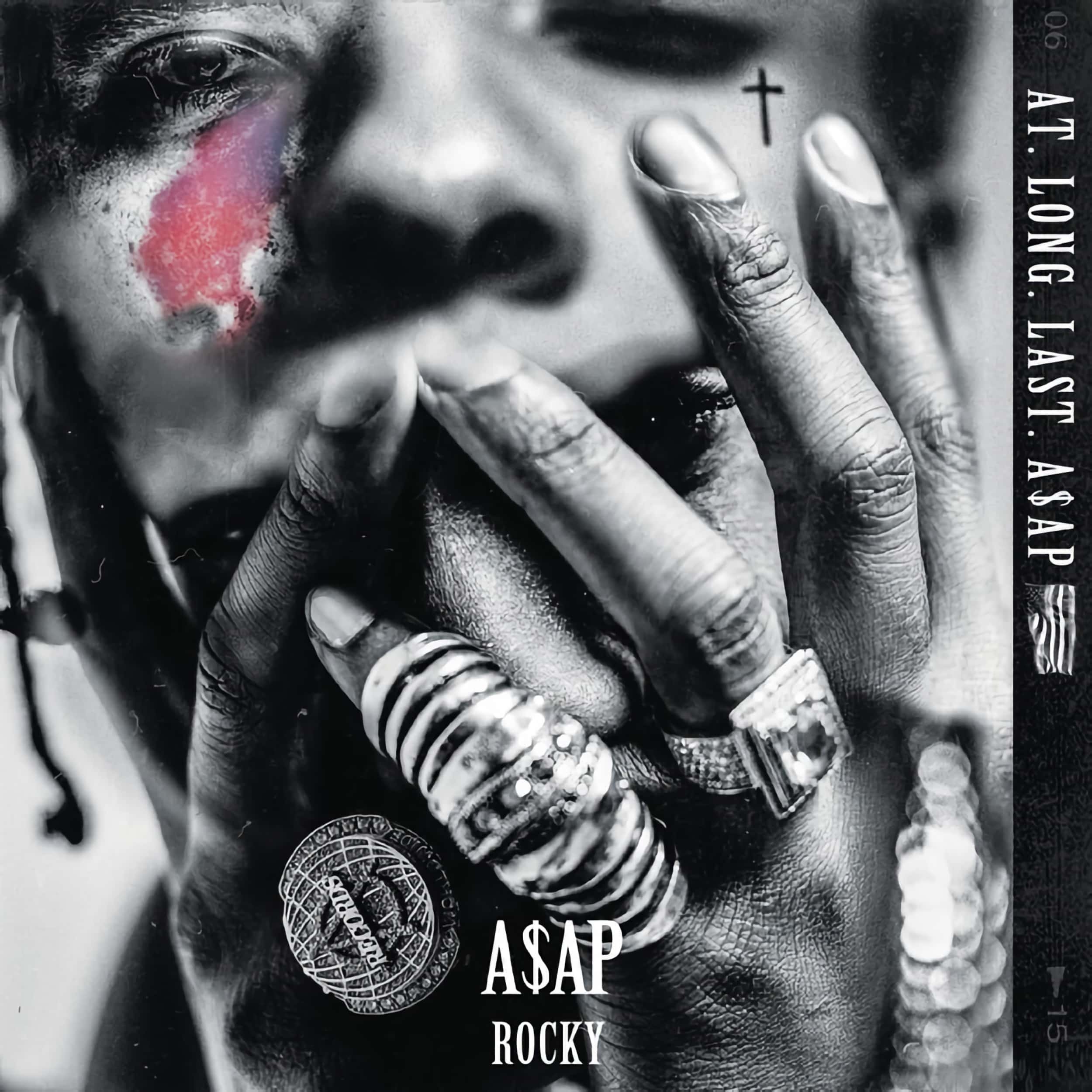
A$AP Rocky – AT.LONG.LAST.A$AP
AT.LONG.LAST.A$AP is a sonic masterpiece, but that distorted album artwork gives me the heebie-jeebies.
It's a homage to the late A$AP Yams, but there are many better ways to honor the dead.

Albert King & Otis Rush – Door to Door
Well, Otis Rush is missing from the album cover while Albert King looks as if he’s in agony.
Look, I know this is the blues, and the intent is to show emotion, but it’s one of the worst album covers in my collection as a shot up someone's nose has never been appealing.
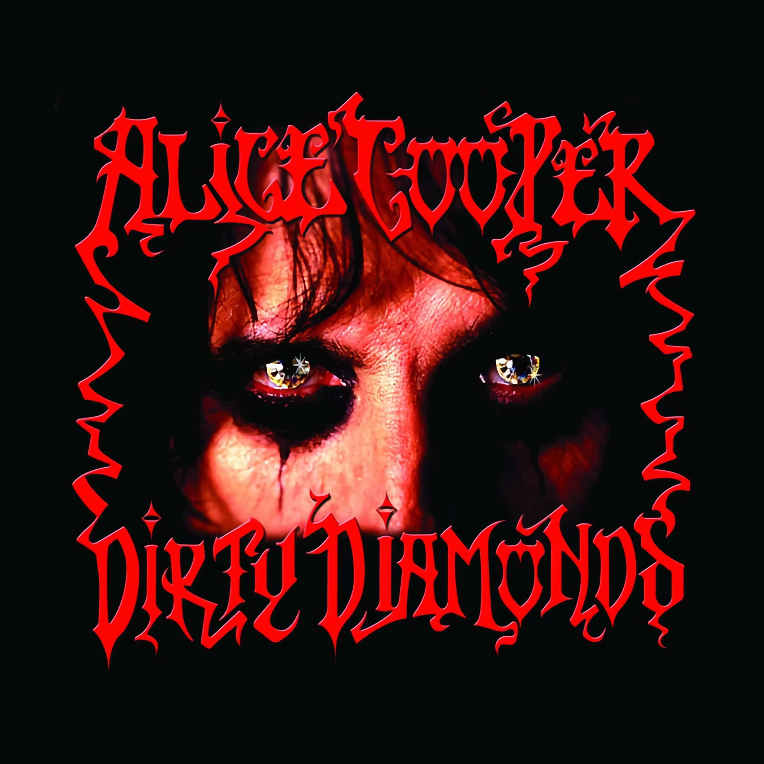
Alice Cooper – Dirty Diamonds
For a musician of Alice Cooper’s status, Dirty Diamonds is pathetically bad. It is as if Cooper couldn’t be bothered trying. Sure, Dirty Diamonds is far from Cooper's greatest album, and it was released on an independent label, but it simply doesn’t live up to the shock-rock hype that is Cooper's trademark.

Alice Cooper – Hey Stoopid
The shock rocker didn’t disappoint with Hey Stoopid but this album artwork most certainly falls into the disturbing category.
I’ve got a copy on vinyl that thankfully sounds fantastic for the skull doll, mimicking Alice, looks hauntingly into your soul every time I pull the album out. It’s like a grown-up Chucky doll!

Anne-Marie – UNHEALTHY
There are moments in every artist's career when an ideal stands above and beyond common sense. This is one such example and while I understand and respect Anne-Marie's approach to buck the visual expectations associated with the music industry and stardom, I can't help but feel this is the album cover that she'll come to regret as her career progresses and she wishes to be taken more seriously.

Barenaked Ladies – Stunt
While there’s fundamentally nothing wrong with the artwork for Barenaked Ladies’ album Stunt, it’s creepy and is only marginally better than their 1996 album cover for Born On A Pirate Ship.
If you’re after a really good piece of cover art, from the Barenaked Ladies, check out Maybe You Should Drive.

Baroness - Yellow & Green
Okay, so those artists within the sludge metal genre need to shock audiences a little, from time to time, but the sacrificial suggestion here is a little over-the-top.
It simply doesn’t send a positive message to those from outside of the genre and that’s a shame considering it's a solid album.
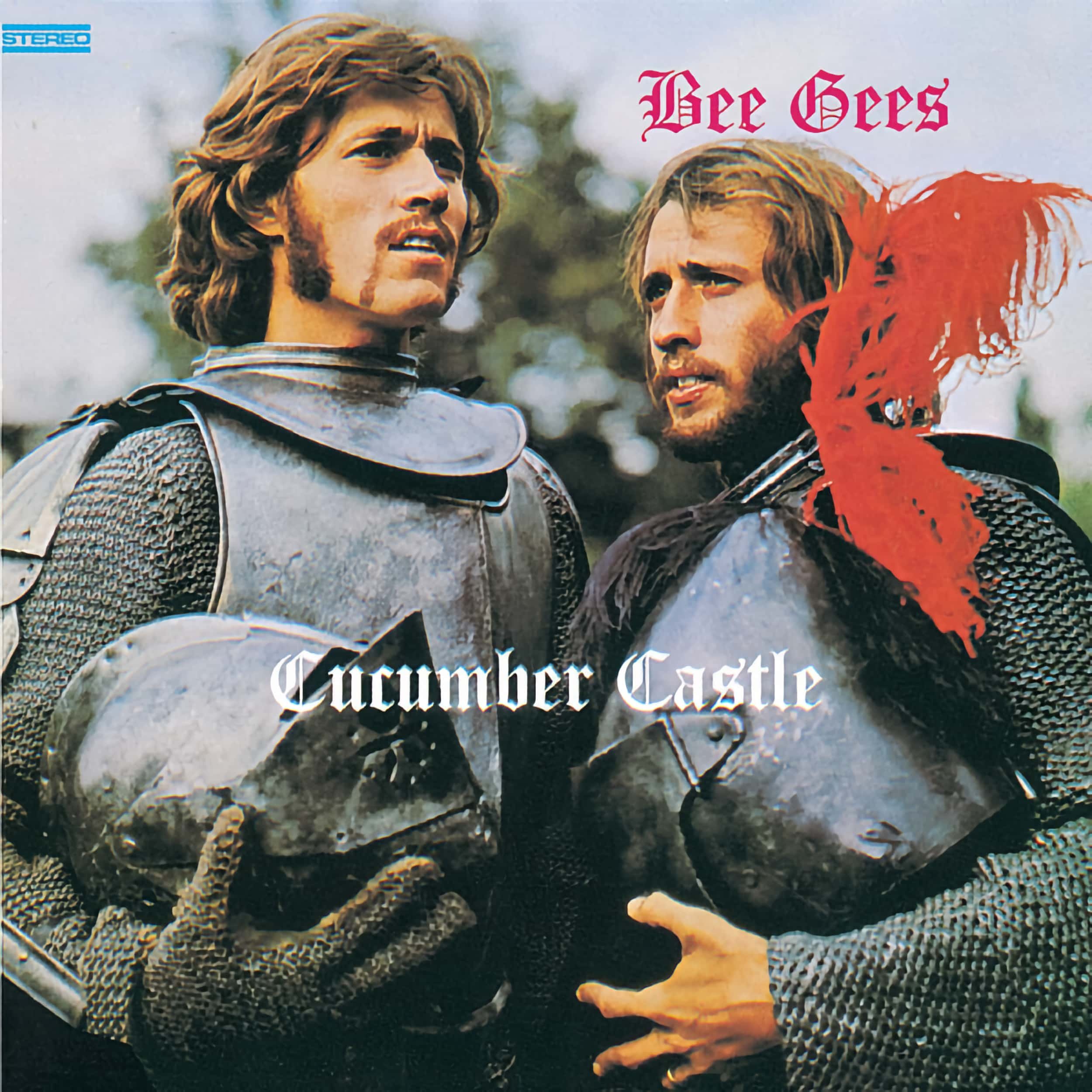
Bee Gees – Cucumber Castle
The Bee Gees sans Robin Gibb was always going to be a tough sell, but Cucumber Castle has just about the worst cover that could have ever been created for a mainstream artist.
Cucumber Castle may have been a soundtrack to the associated quirky comedy film but a lot of people really didn’t think it through.

Billie Holiday – Recital
Released as a compilation of songs from Billie Holiday and An Evening With Billie Holiday the artwork shares its core with the 1953 release of An Evening With… but it makes the songstress look like a demonic vampire.
I get the art style, but this is disturbing and one of the worst album covers I’ve ever come across.
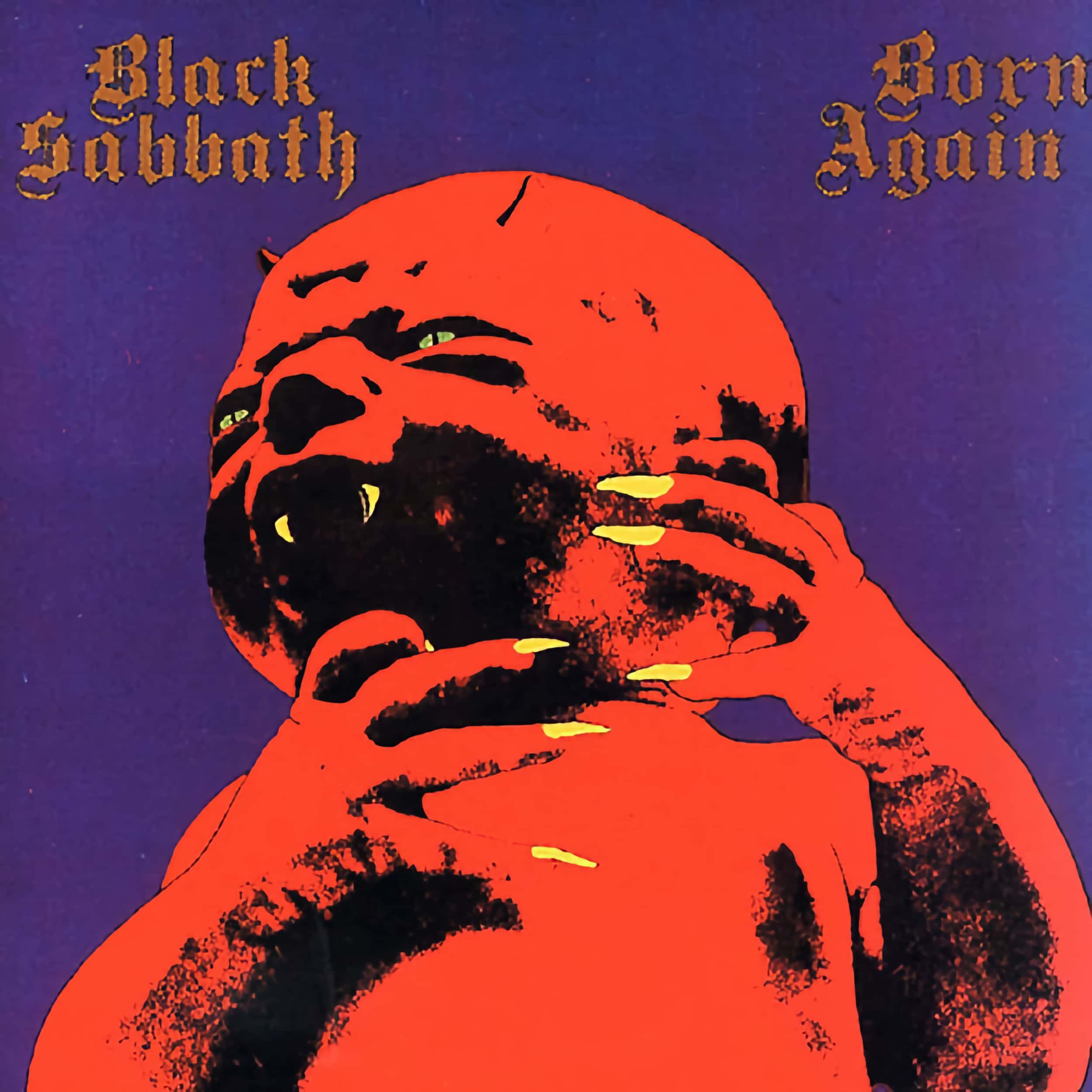
Black Sabbath – Born Again
Ian Gillan apparently threw up when he saw the album artwork that Sabbath maestro Tony Iommi approved. Well, I don’t know about you, but I back Gillan’s attempt to expel the devil for this is one nasty piece of cover art.
Yes, it’s Black Sabbath, but this is one step too far, even for them.
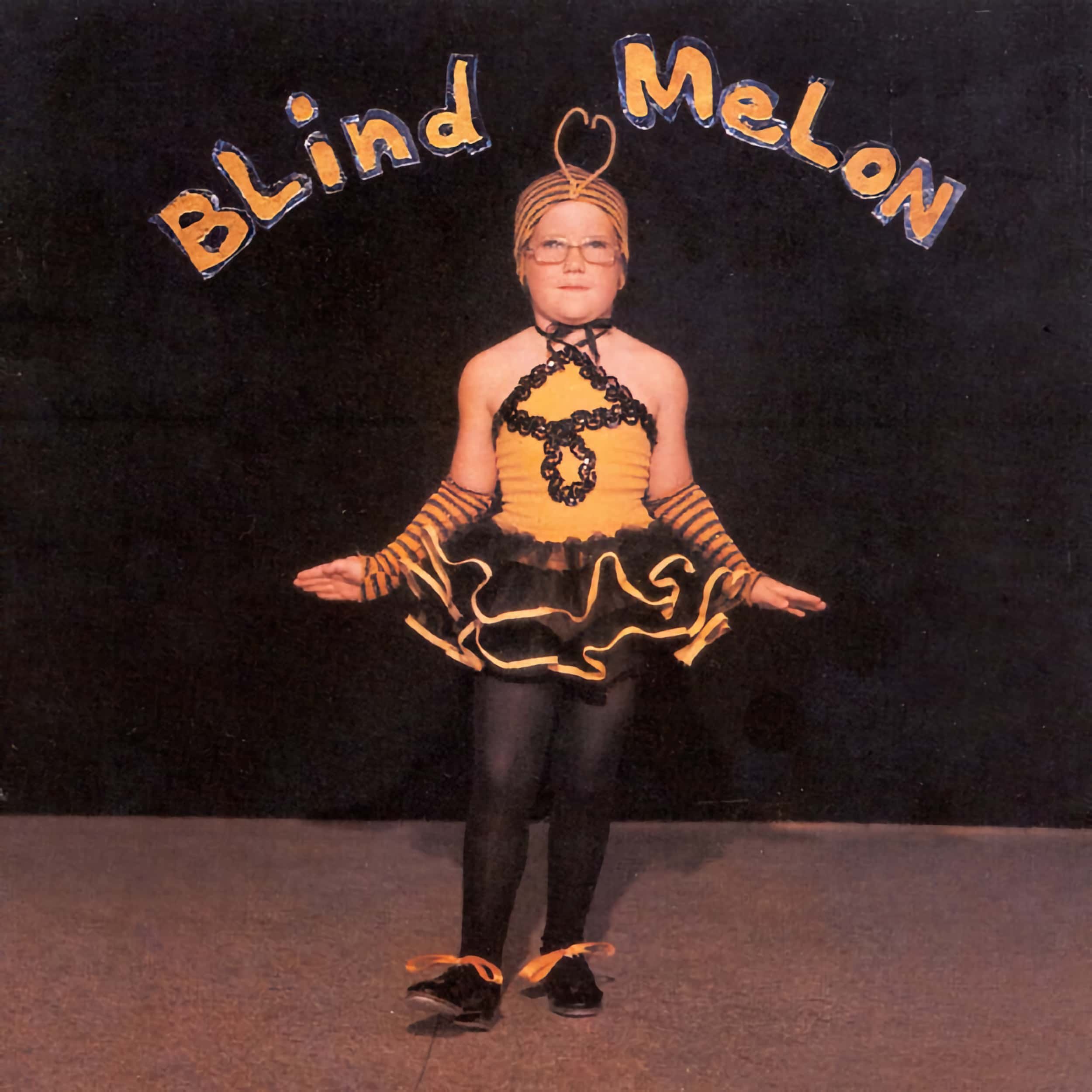
Blind Melon – Blind Melon
I do not doubt that some people will find the eponymous cover art for Blind Melon adorable; it isn’t!
You’ve got to feel for drummer Glen Graham’s younger sister, the Bee Girl, for that is the most embarrassing photo forever encroached upon her life through the success of the album.
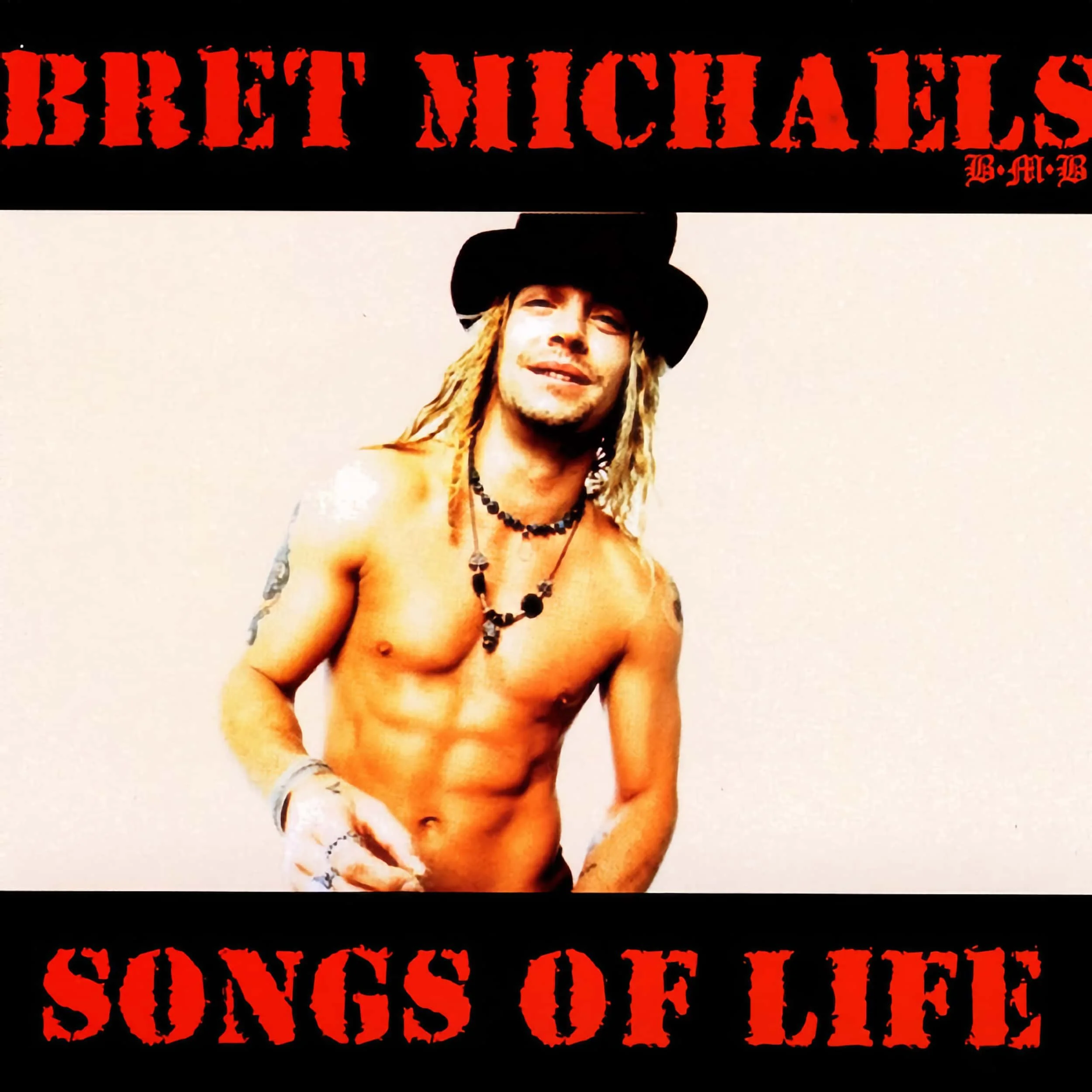
Bret Michaels – Songs Of Life
Okay, so Poison never had the most appealing album covers but this is a truly cringeworthy cover from Poison’s frontman, especially considering the album was released in 2003.
Hey, I’m all for a good physique but it looks like it was put together by an internet-based fan club page…from 2003.

Bruce Dickinson – Tyranny Of Souls
Dickinson is a legend as the Iron Maiden frontman and while his solo output is musically fantastic, the album artwork is nothing compared to Maiden’s. While some may point to Accident At Birth being creepier, the sagging Devil’s man boobs, if it is a man, seriously creep me out.
I wouldn’t look into the album cover for too long, it will steal your soul!

Bryan Adams – Get Up
When you’ve sold more than 100 million records you can pretty much do anything you like but this has to be Bryan Adams’ worst cover for no other reason than it simply doesn’t make sense.
The covering of the face, is that some kind of new Illuminati sign?

Carly Simon – Never Been Gone
How do you go from the beauty and elegance of No Secrets to this monstrosity?
Never Been Gone is, without a doubt, one of the worst album covers of all time. What was she thinking?

Cerrone – 3 - Supernature
There’s a reason why you should never judge a book by its cover and that reason extends to albums; particularly Cerrone’s 3 - Supernature. Released in 1977, 3 - Supernature would have terrified older generations, and it still does, for you need to get past the album artwork before you can enjoy the addictive, and sonically impressive, disco vibe.
While Cerrone’s artwork is often interesting, 3 - Supernature is the most bizarre and disturbing. It is without a doubt one of the worst album covers I’ve ever come across.
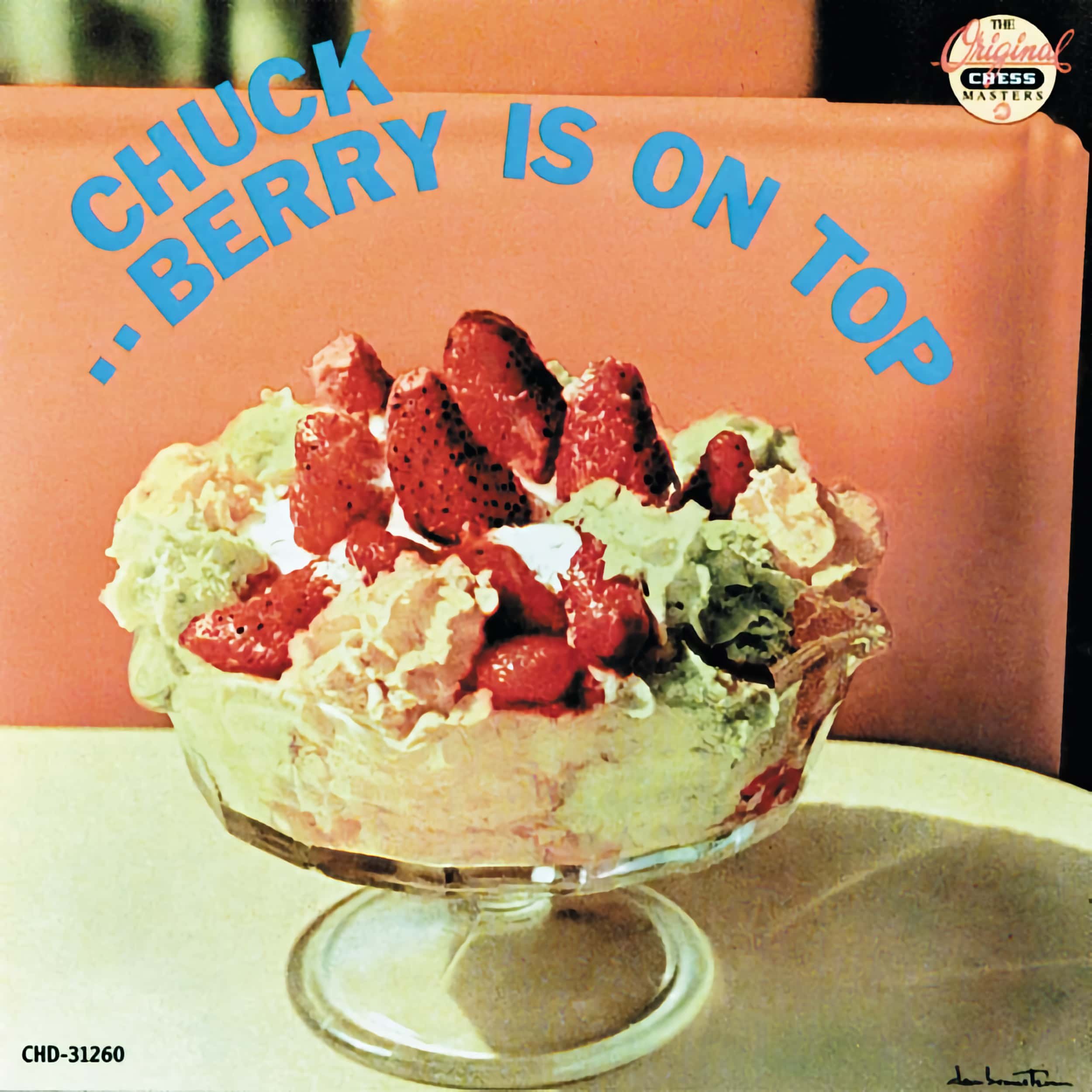
Chuck Berry – Berry Is On Top
The 50s are littered with questionable album artwork and this is no exception.
Yes, we all get the pun, but jeez this is a shocking piece of cover art. I’d even go as far as saying that it’s insulting to Berry himself for the Father of Rock and Roll deserved far more.

Cliff Richard – 40 Golden Greats
The idea is sound. It works as a reflective piece of art depicting Cliff Richard’s legacy, but every time I look at this album artwork I think of the T-1000 shapeshifting assassin from Terminator 2: Judgment Day.
Yes, dear reader, once you see it you can’t unsee it. Sorry!

Corey Taylor – CMFT
To put it mildly, I was in shock when I saw the album artwork for CMFT. It’s underwhelming for someone of his stature and as a living legend, he quite frankly deserved better.
Plus, I can’t quite figure out if it’s a new design for a WWE wrestling belt or a biker’s patch.

Crash Test Dummies – Give Yourself A Hand
This album artwork is wrong on so many levels but more importantly, it’s just a bad piece of visual art. God Shuffled His Feet is significantly better.
Plus, is it just me, or do stuffed and blown-up dolls, creep you out too? It’s not quite Chucky but it isn’t far off either.

David Bowie – Toy (Toy:Box)
Posthumous releases are generally controversial and this shocking artwork is no exception. While it has been said that Bowie himself greenlit the artwork, it goes into the category of what was he thinking? Similarly, his estate should have reconsidered the artwork upon release but I guess it is true to his artistic experimentation, even if it is disturbing.

Elton John – One Night Only
Longtime readers will note my admiration for Elton John, but this album’s artwork makes me cringe every time I see it.
Perhaps Billy Joel was right when he suggested that John should stop releasing albums for his cover art is getting worse as he ages. All one needs to do is look at The Lockdown Sessions to know that the Elton we know and love is no longer at the helm.

Elvis Presley – Elvis Country
Okay, so some may proclaim the artwork as being cute. Nope, no, I’m not one of them.
I get it, they wanted to take us back to the origins of Elvis and while the album artwork in this case works, it is cliché and I’d argue that it would have been embarrassing for the King of Rock and Roll!

Escape The Fate – Chemical Warfare
Gas masks, by their very nature, are creepy and with what we’ve all been through over the last couple of years, the last thing we need to see is artwork that depicts such despair.
While I’d love to say this disturbing artwork is from a time before our current zeitgeist, Chemical Warfare was released in 2021.

Galantis – Pharmacy
What a cute little…ahhhh!!!
Okay, so it’s kinda cute, when it’s not creepy, but let’s be honest and ask ourselves where the actual cat’s face went? Cringeworthy? Yes!
No doubt an interesting concept, but the meaning and relationship to the music are somewhat lost on me.

Graeme Connors – The Best...'til Now
So cringeworthy!
Seriously, if this is the best that Graeme Connors could release then you certainly aren’t going to be tracking down this album based on the artwork. A shame considering he’s a very talented musician with otherwise exceptional album artwork.

Horisont – Sudden Death
Yes, dear reader, this album artwork needs no interpretation for it is literal to the album’s title.
Horisont has some incredible album artwork, such as that seen on About Time. I truly believe that they could have been more inventive here and that a little less death, in our current time, would be appreciated.

Iggy Pop – Beat Em Up
Who doesn’t like a little Iggy Pop?
While I don’t dislike this cover art per se, it’s one that I feel awkward looking at or displaying when playing the album, especially in front of my family. Yes, that likely says more about me than the album artwork, but I’ve no doubt many will find this disturbing, hence its inclusion.
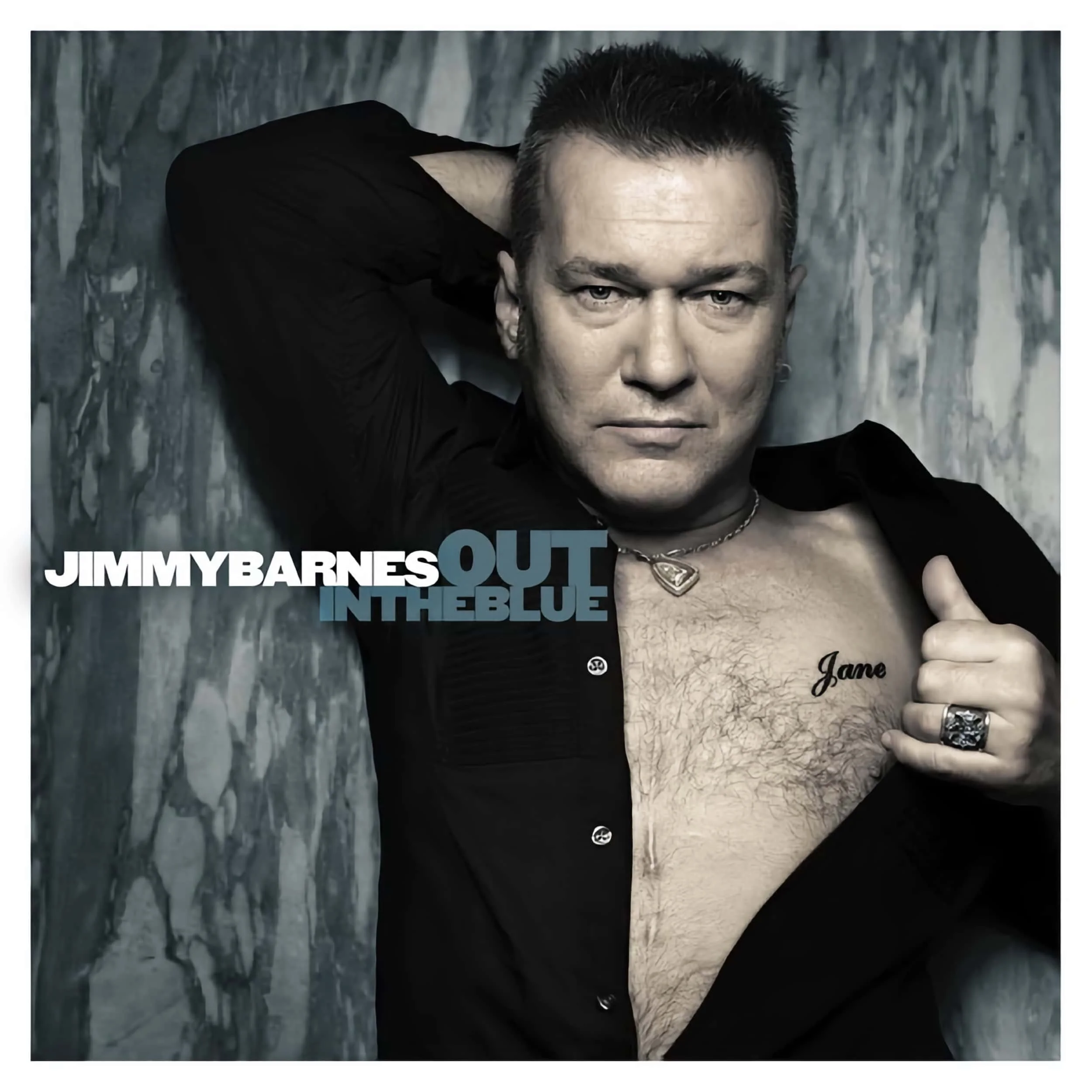
Jimmy Barnes – Out In The Blue
When you think of the Cold Chisel frontman, this most certainly isn’t the artwork that you’d immediately think of.
There is no doubt in my mind that an artist of Barnes’ stature deserves better album artwork and it’s artwork such as this that detracts from the music itself.

John Wesley – A Way You'll Never Be
Yes, dear reader, it reminds me of Pink Floyd’s cover art for Wish You Were Here but perhaps even more disturbing is the lack of correlation with the album’s title, song names, and the music.
I’m not saying the artwork is bad, but it’s mildly disturbing in a way that Pink Floyd’s isn’t.

Kadavar – Rough Times
Okay, so whoever this was is having a very hard time.
As with many of the album covers featured here, I can see the intent they were going towards but as I age, I become increasingly aware of my own mortality, and art such as this becomes disturbing rather than simply being cool; a killer album nonetheless.

Kesha – Gag Order
Asphyxiation should never be presented in this manner as Gag Order reminds me of a suicide bag; a very real device used for such a purpose. It amazes me that the record label would let this go out. While I believe in art as a form of expression, when suicide is a key issue in our modern society, the last thing we need is to be exposed to imagery like this. Music should empower, and uplift us, and while the music contained within Gag Order is solid, the album cover is so disturbing that I have no intention to ever listen to it again.
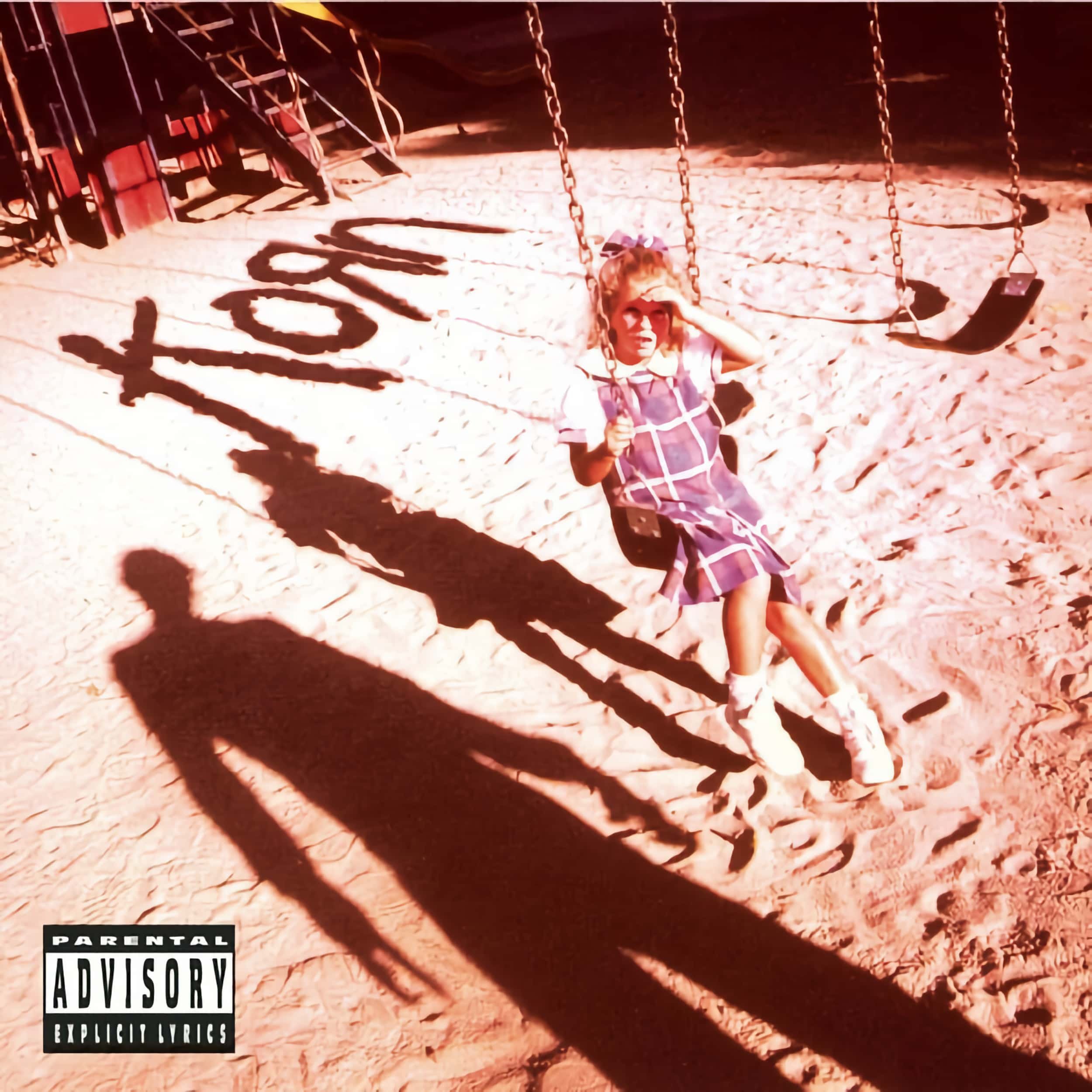
Korn – Korn (Self-Titled)
Korn is one of my favourite bands. Their music is infectious but their artwork is often creepy as hell.
I get it, their lyrics tell similar stories and delve deep into the twisted human psyche, but as a father, Korn’s Self-Titled artwork creeps me out.

Korn – Life Is Peachy
You’ve gotta love the concept Korn went for on their second studio album but you can’t look at it without getting a shiver up and down your spine.
I don’t know about you, but I may never look into a mirror the same way again, for who knows what I may see.

Korn – Requiem
Korn’s latest release has to be the worst album cover they’ve ever approved. It’s so disturbing that I’m surprised it got past the censors.
Does it tarnish the music, YES!
If you’ve got any doubt about how bad this artwork is, check out the animated art on Apple Music; truly disturbing!

Marilyn Manson – Holy Wood
Manson, like Korn, is controversial but the sacrificial imagery goes a little too far for many people.
Don’t get me wrong, the design is great and works well within Manson’s persona and the intended purpose of criticising censorship and martyrship, but it is nevertheless disturbing.

Marilyn Manson – Portrait of an American Family
Yeah, the Manson family!
By this stage, we all shouldn’t be shocked by Marilyn Manson but this is one piece of nasty album artwork. That said, what a better way to launch one’s self with artwork that would shock.
Still, I don’t wish to own this on vinyl. It gives me the heebie-jeebies!

Metallica – Load
Frank from Channel 33 RPM put it perfectly, “you can’t unsee this”!
Yes, dear reader, the artist entitled this piece: "Semen and Blood III" and guess what, that is the literal interpretation for it really is the artist’s bodily fluids. I’m unsure if this comes under worst, or disturbing, but maybe interesting would be a more valid category!
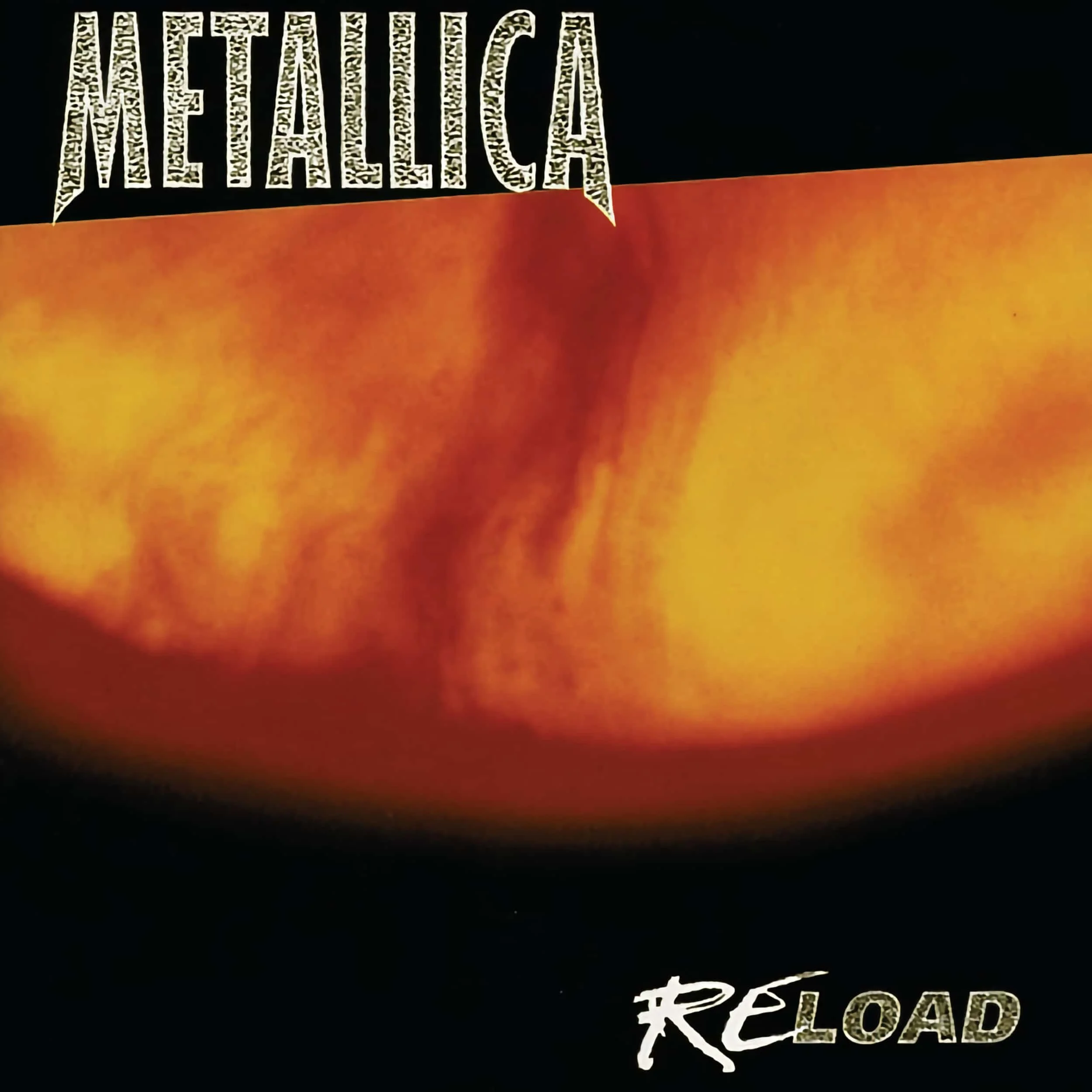
Metallica – Reload
Reload continues the interesting aspect for Andres Serrano was at it again, melding bovine blood and urine on this one.
Of course, when I think of reload, in context with the previous album cover, I see a scrotum that has been in the tighty-whities for too long. My interpretation certainly plays into the Load artwork but either way, it’s disturbing.

Michael Henderson – Slingshot
Okay, I swear this wasn’t planned to follow Load and Reload but sometimes things just fall into place.
Seriously, Slingshot is a great album but the artwork is cringeworthy; even with Henderson’s buffed physique.
It's another questionable piece of album artwork from the 80s.
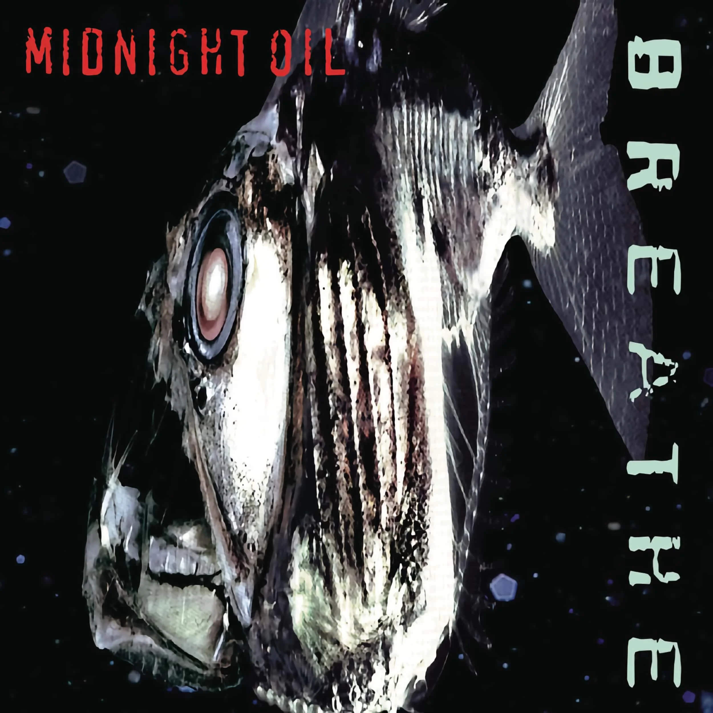
Midnight Oil – Breathe
It isn’t just the shock rockers that want to be noticed for the politically charged environmentalist band, Midnight Oil, absolutely wished to send a message with this artwork and while I agree with their intent, it’s disturbing to look at.
This is most certainly one piece of their catalogue that I don’t wish to own on vinyl. Yes, music comes first but I have to look at the artwork!

Ministry – Dark Side of the Spoon
Yes, Dark Side Of The Spoon’s album artwork created controversy. So much so that the album was pulled from some retailers upon release.
Obviously, one can’t appreciate Dark Side Of The Spoon without seeing the correlation to Pink Floyd’s Dark Side Of The Moon, but Dark Side Of The Spoon has multiple meanings. Yes, the artwork presents another perspective but the album’s title was more closely aligned to their addiction to heroin at the time, thereby making the album title a logical choice.

Neil Young – Everybody’s Rockin’
It was the 80s. Everything was pink. Knee-high socks were in style and, yes, I grew up in the 80s. All I can be thankful for is that my formative years were positioned firmly in the 90s.
Seriously, Neil, what were you thinking? Pink really isn’t your colour! Great album though!

The Notorious B.I.G. – Ready To Die
Maybe it’s just me but kids should never be associated with the word die. I’d even go one step further and suggest that kids shouldn’t be included in album artwork as they lack the ability to make individual and informed choices.
That, of course, is a discussion for another day!

One Less Reason – Precursors, Vol. 1
Over the years I’ve seen my fair share of horror films but the grotesque parts are often shown in the blink of an eye. Well, album artwork, unless it is the animated album artwork on Apple Music, doesn’t move and you have to look at it.
Plus, let’s be honest, this album’s art isn’t even very good so it falls into both the worst and disturbing categories.

Orleans – Waking & Dreaming
They may be a bunch of good-looking guys, but this is one album that you'll want to listen to with your ears for it is near impossible to take Orleans seriously with this cover art. Seriously, who thought this was a good idea?

Otep – Atavist
Okay, so this is a really cool piece of artwork but it’s included here because I’m certain that it will disturb many of you.
There’s plenty to unpack here, but it is the overarching satanic meaning and interpretation that will bring many to shy away from Otep’s Atavist.

Ringo Starr – Stop And Smell The Roses
Okay, so the 80s was a cringe-worthy time that even nostalgia can't remedy, but what was the former Beatle thinking when he agreed to the album artwork for Stop And Smell The Roses? Granted it isn't as bad as Old Wave as it looks like a mugshot was chosen for the cover, but it simply doesn't synchronise with Ringo's legacy. Although, when I think about it, the Fab Four did release Yesterday And Today; some really disturbing album artwork! Click on the link if you dare, for once you see it, you can't unsee it.

The Rolling Stones – Undercover
The Stones have certainly had some interesting and inventive album artwork that took advantage of the vinyl format. Released initially with peel-off stickers, I’ve no doubt this cover is a bit of a novelty but it simply isn’t good.
Imagine getting a first pressing home to only find that peeling the stickers resulted in more geometric shapes. What a tease!
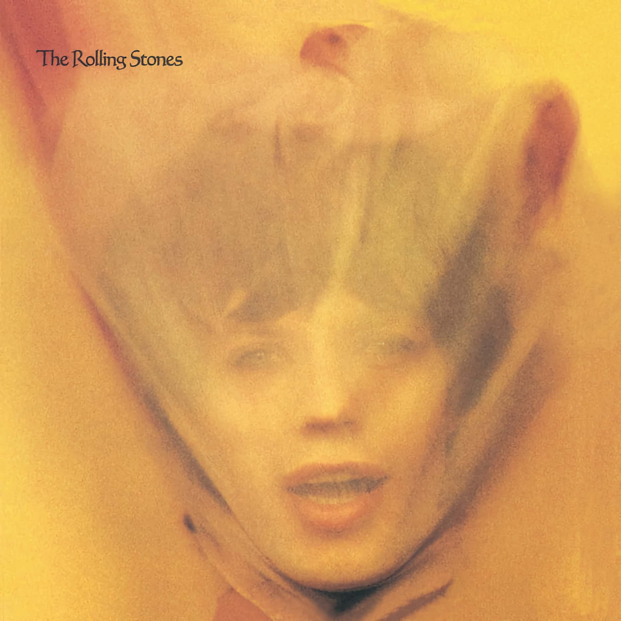
The Rolling Stones – Goats Head Soup
Is it Jagger in the womb? Or does he have pointy ears on top of his head? It’s unique, I’ll give it that.
Still, when you look at the artwork it’s a little disturbing, isn’t it?
That said, it’s better than Dirty Work; an album that didn’t make the list but is one of The Stones’ worst album covers.
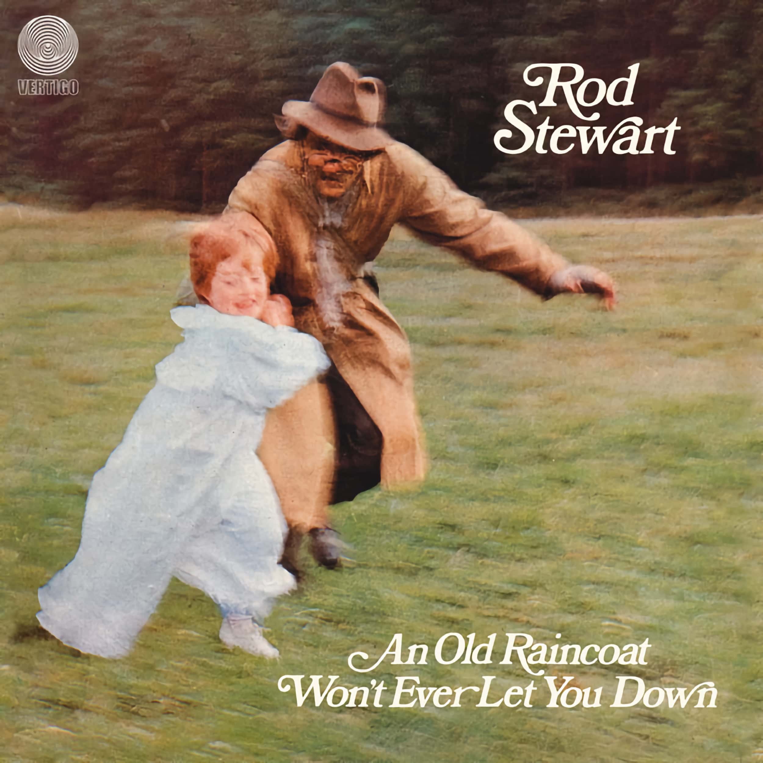
Rod Stewart – An Old Raincoat Won’t Ever Let You Down
Rod, what were you thinking?
Okay, so it was his debut release but a cover such as this had the potential to bury a career the moment it was released.
It simply doesn’t work on any level and really showcases just how banal artwork was in the era; especially for new artists.

Rose Tattoo – Assault & Battery
Come on guys, let’s hug it out!
When you think of Rose Tattoo, and the hard rock genre in general, you really aren’t thinking about embracing anyone, for you want to get loose as you rock out. Of course, this wasn’t an isolated incident as they’d hug it out again on Scarred for Life.

Shakira – Oral Fixation, Vol. 2
It’s funnier than it is disturbing or simply bad. Seriously, we all know that the baby doesn’t want the Apple but the implication and how it relates to biblical aspects is where humour can be derived from it.
Of course, I’m certain that some people will find it disturbing but sometimes you have to see the funny side of things.

Slash – World On Fire
What a mishmash!
Slash’s album artwork keeps getting worse. It’s as if he’s lost his mojo. While not as boring as Living The Dream or 4, it’s simply bad and uninspiring.
Disappointingly, the music isn’t much better on this particular release.

Soft Cell – The Art of Falling Apart
Visually, splitting faces, amongst a smorgasbord of trash, makes this album cover one of the most hideous on this list. That said, Soft Cell’s The Art Of Falling Apart is musically enjoyable, but this is one album that you really wouldn't want to pick up on vinyl for the larger canvas would only worsen things.
I will concede, however, that the artwork represents the thematic elements of the album and its title. It's just that it's horrid to look at and in this instance, I'm grateful that we listen with our ears and not our eyes.

Spiderbait – Grand Slam
I swear some artists are popular because of their album covers and, in this case, Spiderbait has instantly recognisable artwork. Although, it doesn’t mean it’s great.
Arguably, Shashavaglava is worse but it isn’t in my music library, hence it’s not on this list. Either way, Spiderbait’s artwork is just weird!

Timothy B. Schmit – Playing’ It Cool
I’m not afraid to admit that I have a man-crush for Timothy B. Schmit, but this album artwork turns me cold.
Seriously, it’s so bad that you can see Schmit questioning his life choices as the photograph is being taken.

Tom Jones - Praise And Blame
While the music is extraordinarily good, the artwork is absolutely horrid. I get it, it shows a place of worship that links into the overall themes of the album, but the chosen design elements and the photograph itself, aren’t exactly compelling. Seriously, if you saw that on display at your local record store, you’d give it a miss, wouldn’t you?
In my mind, all Tom Jones albums should feature Jones on the cover and while Jones may have wanted the songs to speak for themselves, I feel the artwork on this particular album takes away from the incredible musical experience you’ll have when listening to the record.
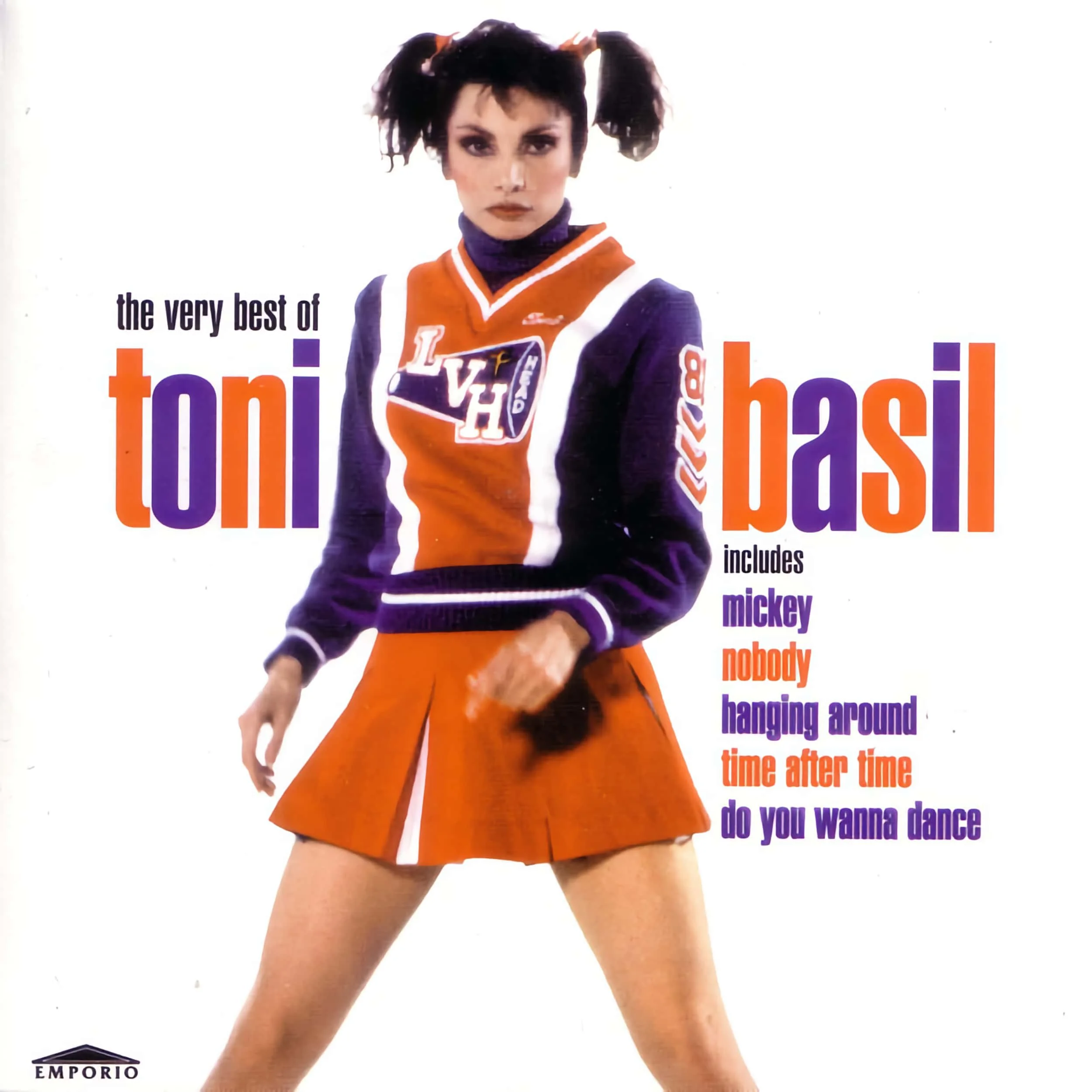
Toni Basil – Mickey: The Very Best of Toni Basil
Forever known for the teen-pop hit, Mickey, Toni Basil never stood a chance when it comes to being accepted as a serious musician and this artwork certainly does her no favour in that regard.

Young Fathers – Cocoa Sugar
It’s striking and once you see it you can’t unsee it, but if we’re being honest, it isn’t very good and is a little disturbing.
Yes, it’s creative but this is one piece of album artwork that is not going to age well; at least the music will!